First of all, I want to say the last two weeks have been surreal, and we all deserve a deep breath.
I’ve been delighted by the intentional way people are being good to each other and despite massive shifts and challenges, I am holding the energy that we will come through COVID better than we were before.
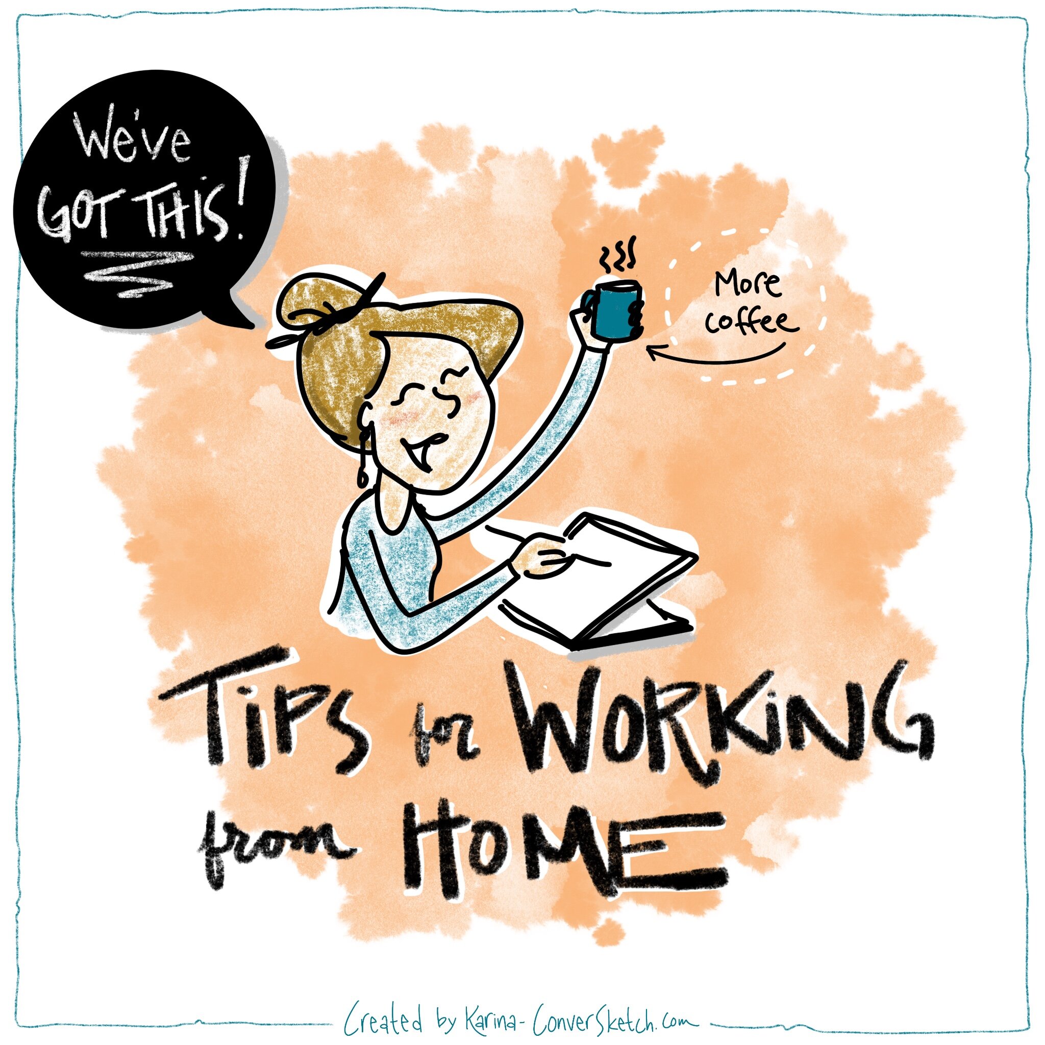
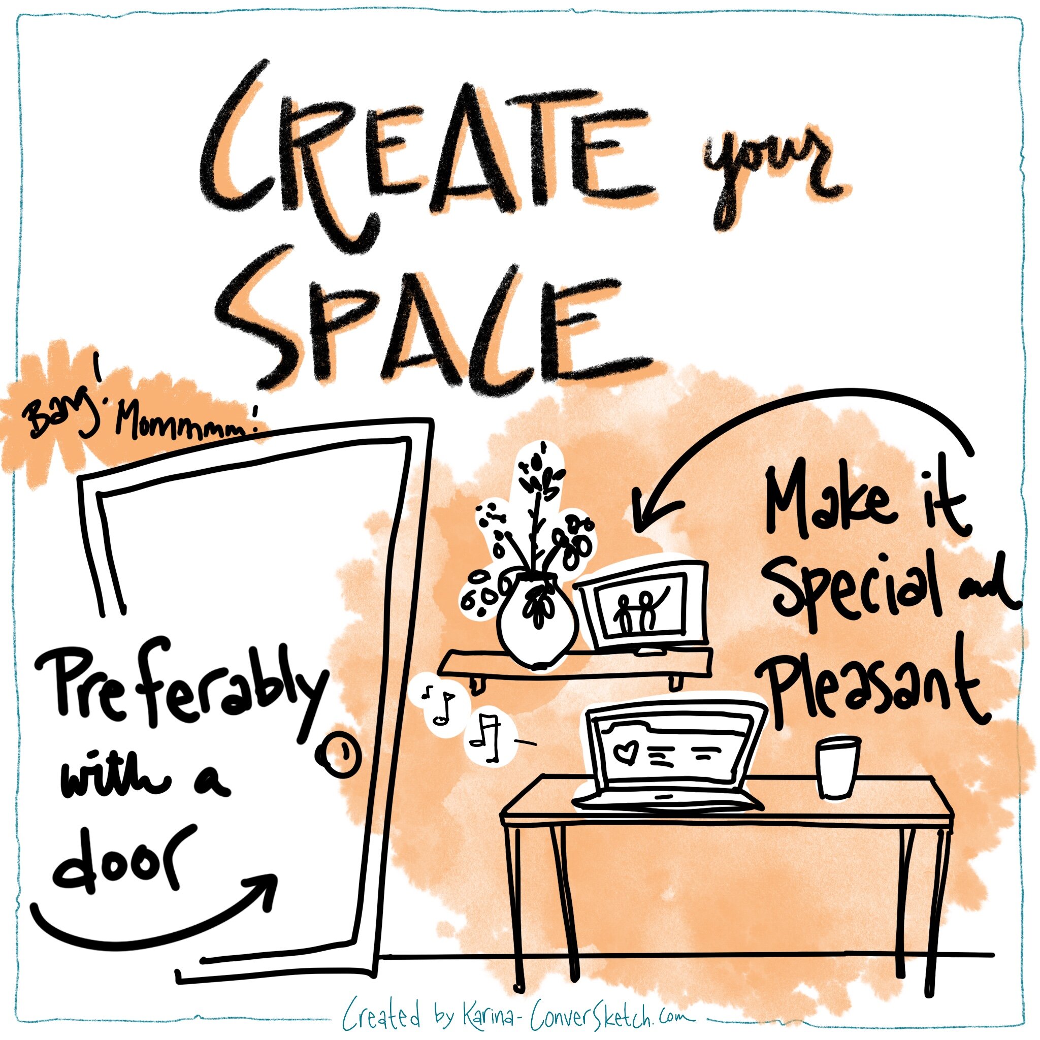
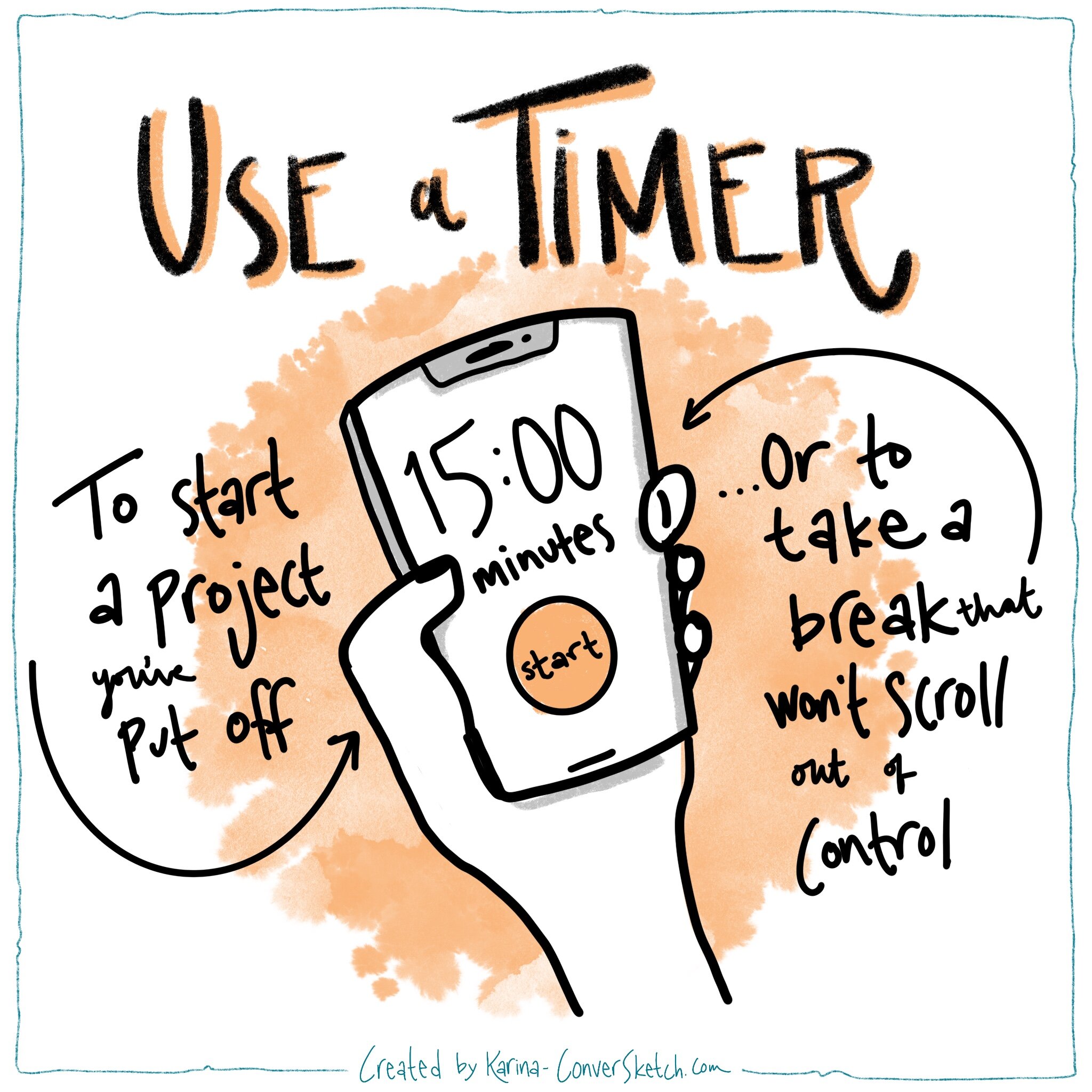
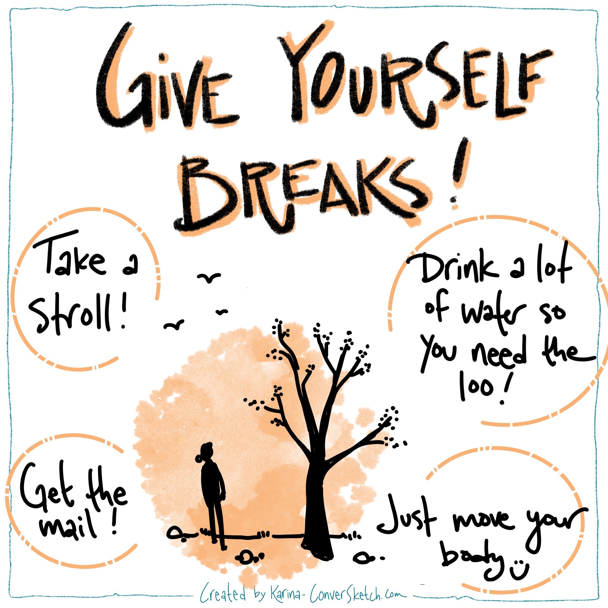
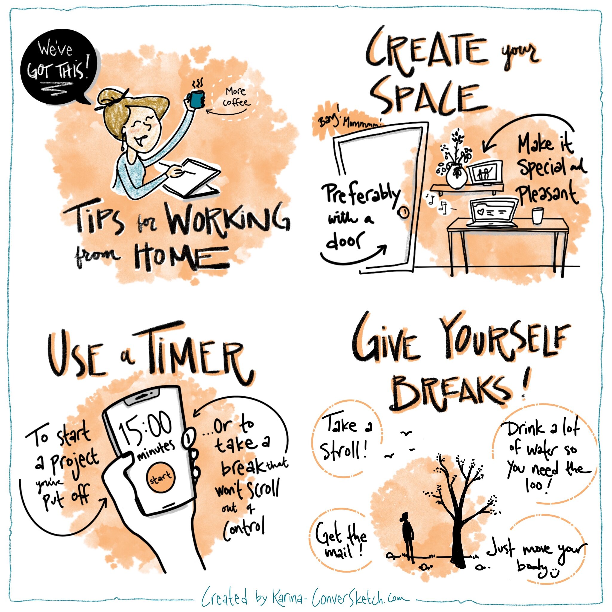
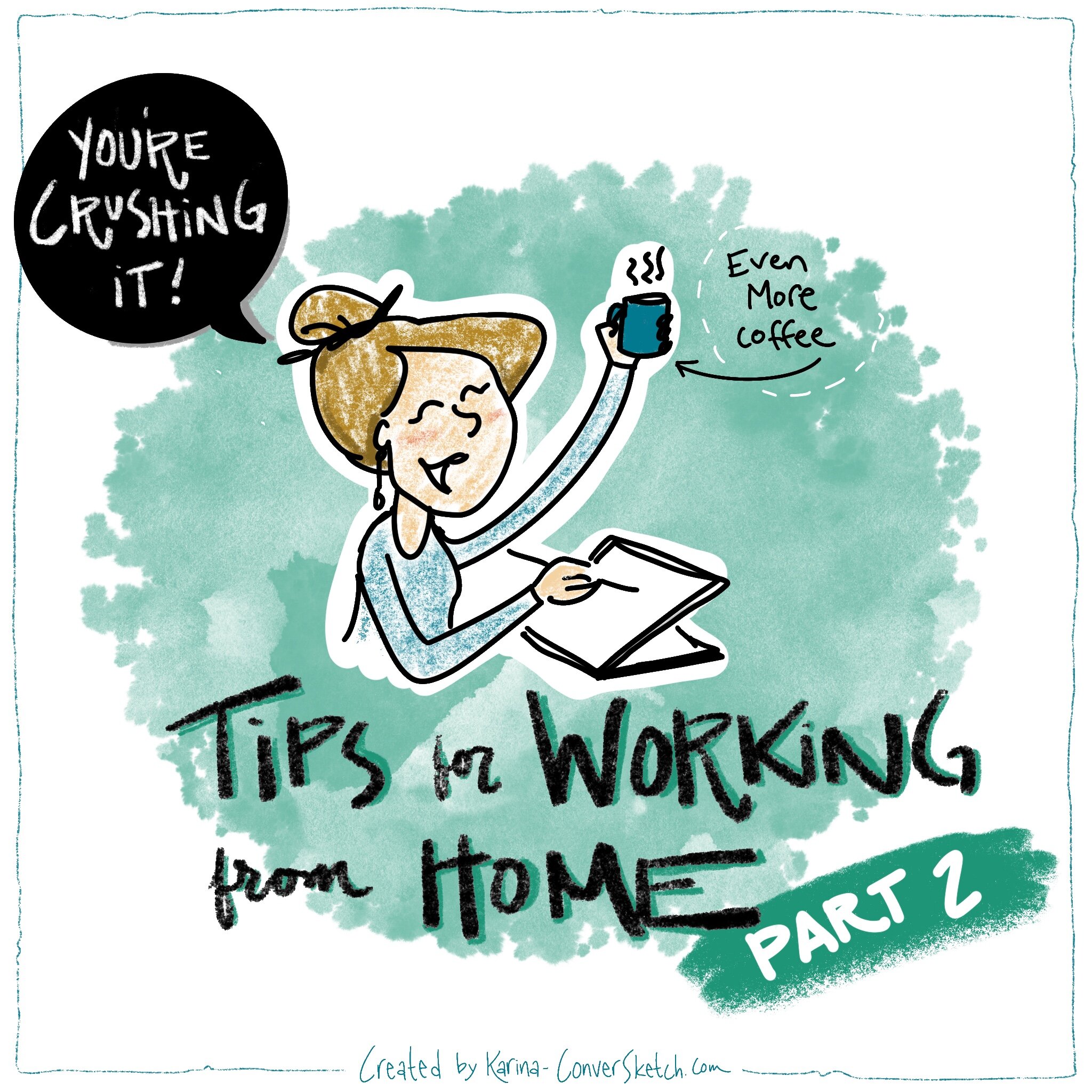
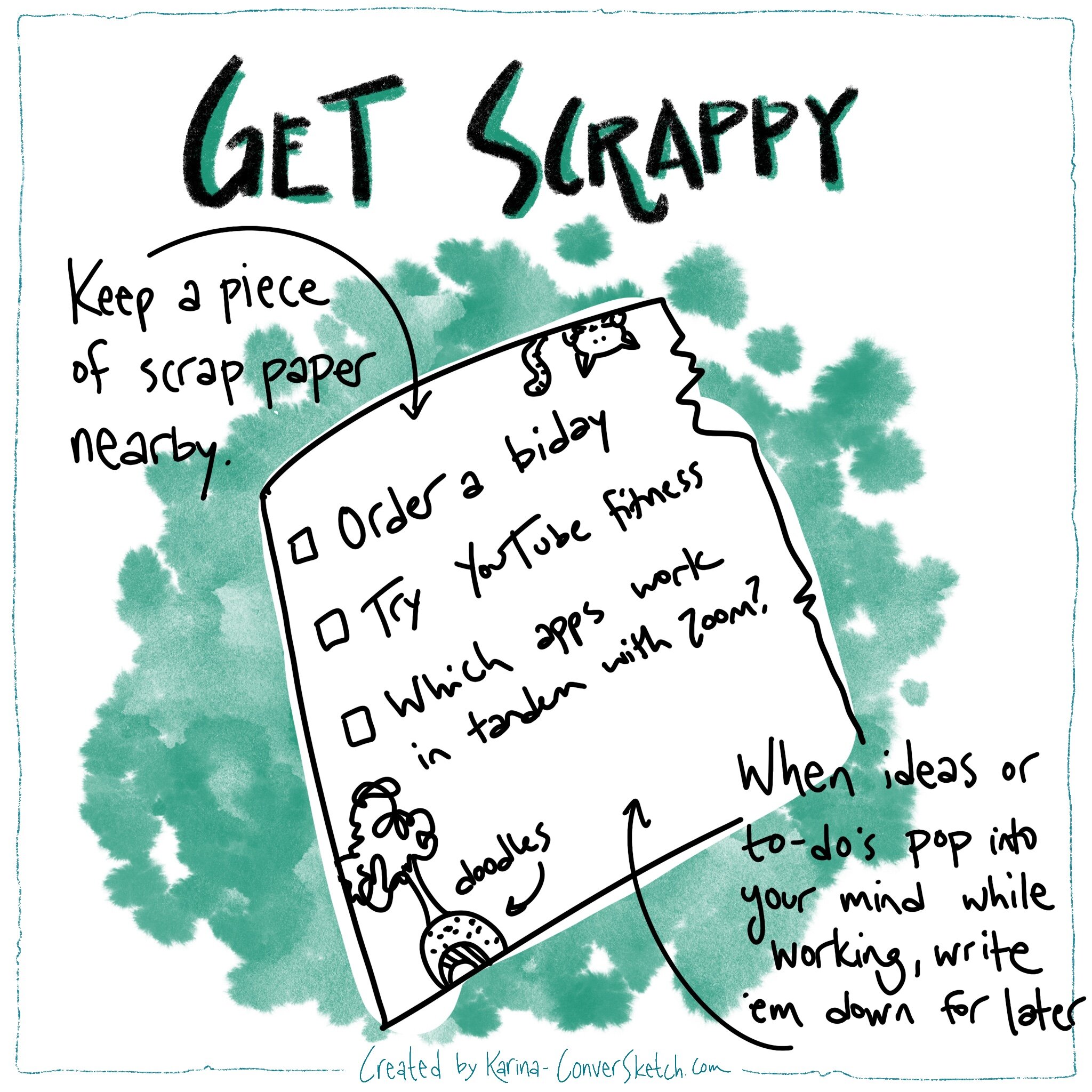
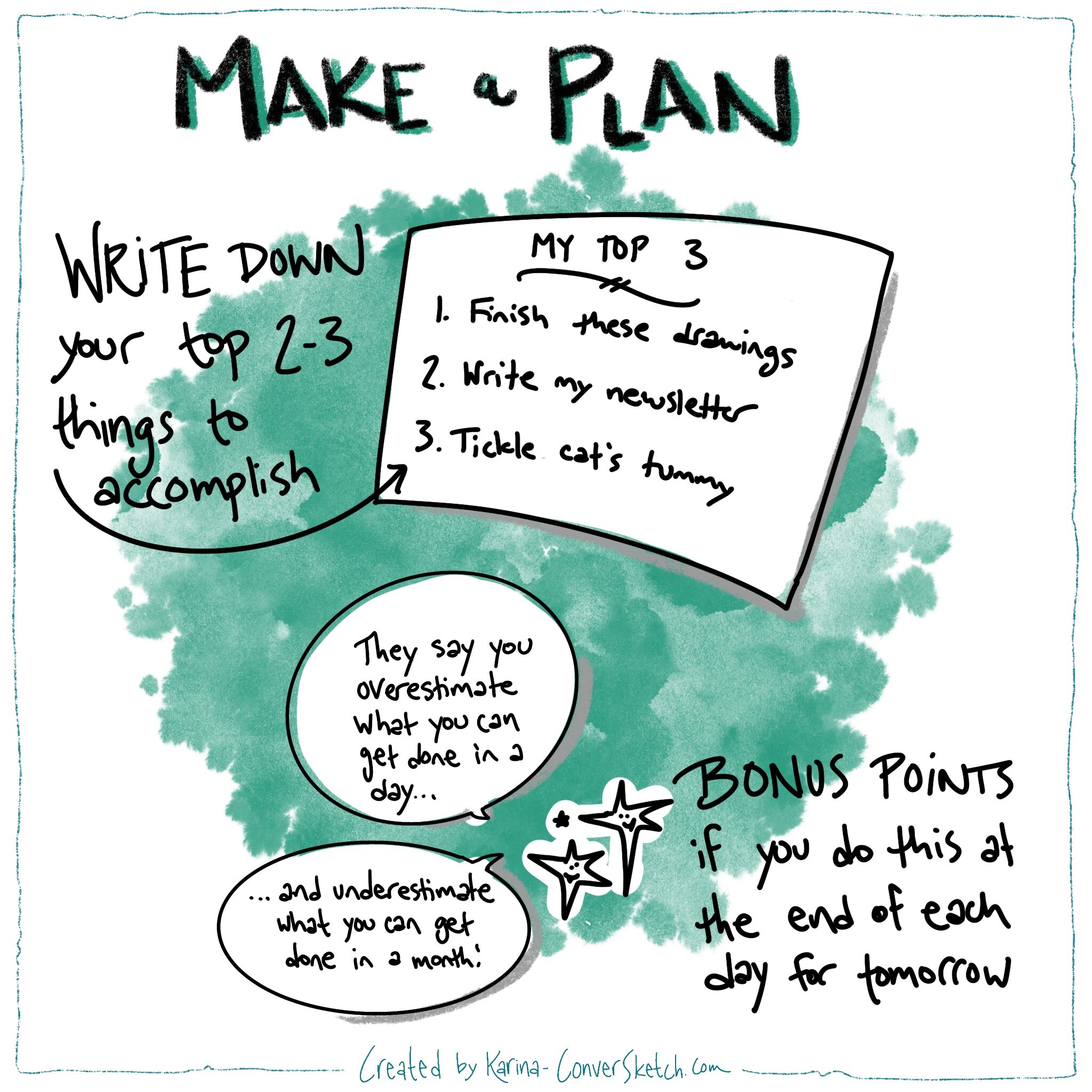
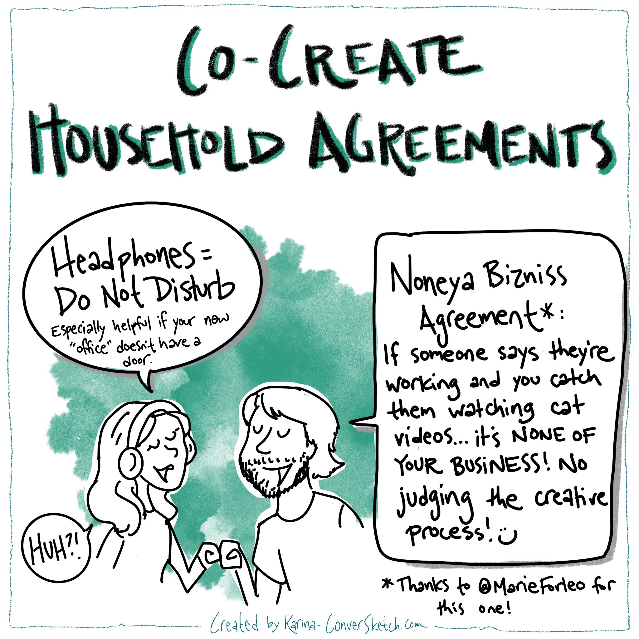
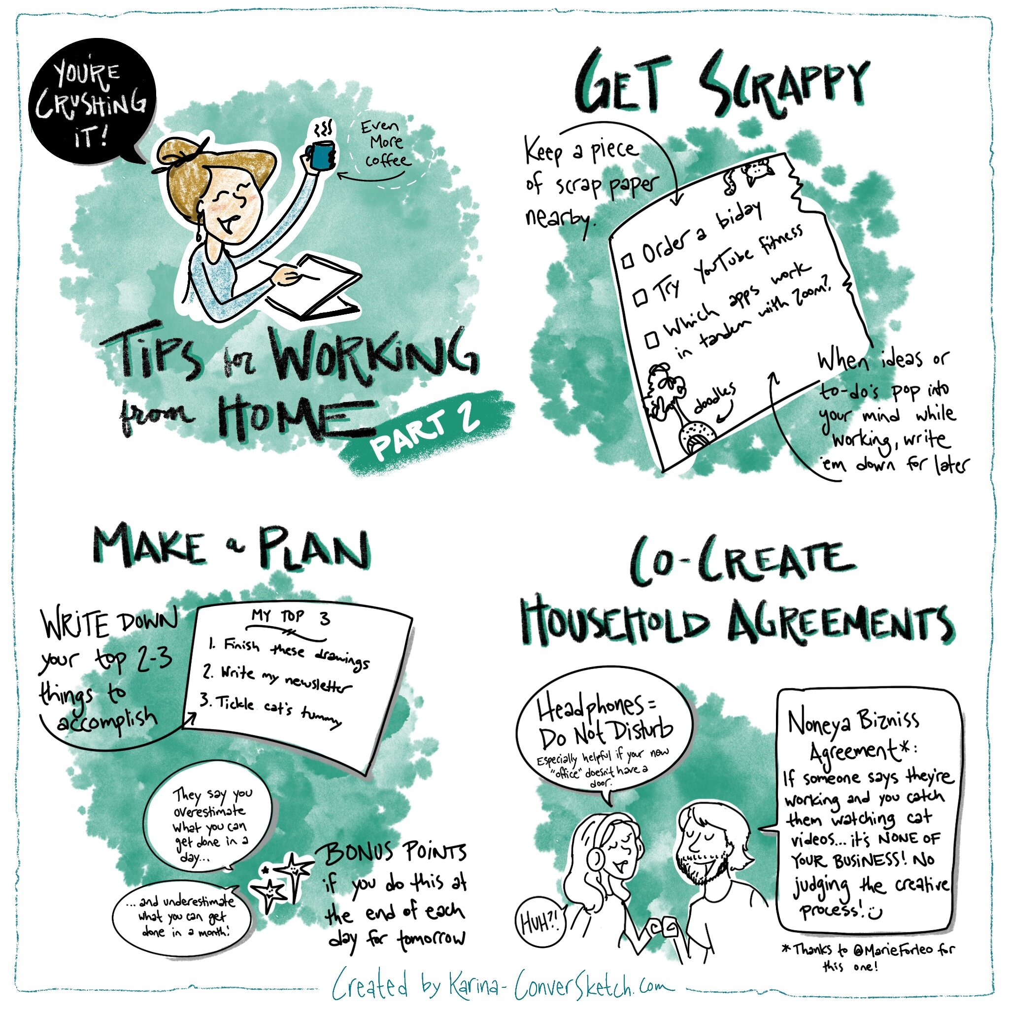
As I’ve been hearing stories of the challenges of shifting to working from home, I wanted to share a few of the tips I’ve learned from other entrepreneurs, as well as through trial and error over the past 6 years of owning my business and working out of a home office.
Without further ado — I give you: llustrated Tips for Working From Home!
Click through on each to see the different tips!
If you need a daily dose of uplifting stories, I love @Upworthy on Instagram. And of course for mellow snippets of the garden, chickens, and bees, come on over to my feed too!
Once again, thank you from my heart and soul for your support, great senses of humor, brilliant minds, collaboration and what you're each doing to make the world a better place.
Cheers,

Where in the World is ConverSketch?

At Home! I hope you are too :) Even though live events have been cancelled for the next few weeks, I’m always impressed with how my clients adapt and innovate on the fly, and I’ve been live digital graphic recording for a few projects on Zoom.

Phoenix, AZ At the third annual ShapingEDU Unconference. This group in particular is on the cutting edge of technology and learning, and there’s no other group I’d rather adjust on the fly with. We went from a hybrid in-person and remote meeting on the first day to fully remote on the second — more on that in the next newsletter!
If you’re finding yourself on more video calls than ever before and need a way to keep participants focused and anchoring participants to a common story (theirs!), let’s explore how to leverage digital graphic recording or remote facilitation for you!